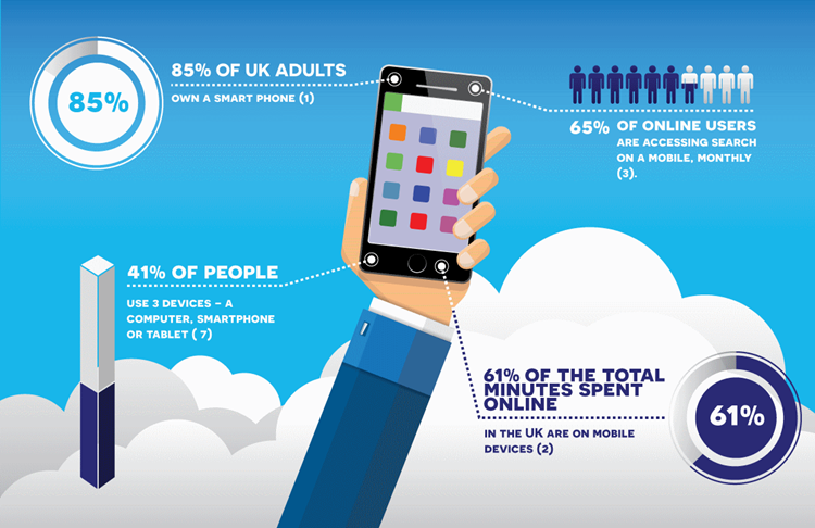
85% of UK adults own a smartphone(1) and 61% of the total minutes spent online in the UK are on mobile devices(2). If you look at your website statistics I guarantee that your website will have been accessed from a mobile device.
I've written a lot about the importance of mobile-friendly websites for small businesses, but I still come across those, daily, that aren't. To be competitive, your website needs to be designed and built so it doesn't just feature well in mobile searches but also performs perfectly to keep your visitors engaged and interested once they are browsing your content. But it's not just your visitors your mobile website needs to impress, it's Google too.
Historically Google would review your desktop website to work out what your website is about (called indexing) and where to rank it, when a relevant search is performed. Now Google are moving towards indexing and ranking based on "mobile first". This means that the mobile version of your website will be the first place Google will go to find out the information it needs.
If your website doesn't work well on mobile devices you could start to see a dip in your Google rankings, even if the desktop version of your website gives an amazing, optimised experience. Whilst Google is still slowly and cautiously rolling out mobile first indexing, being prepared with a fully responsive and mobile friendly website will ensure that there are no negative effects on your Google rankings. If you're not sure what mobile responsive is check out our FAQ: What is a responsive website?
But back to impressing your visitors which you need to be doing now! 65% of online users are accessing search on a mobile, monthly(3) so to make sure you are being returned in those results your website needs to load quickly and be instantly usable. No more loading icons or expanding/pinching to view content, it just won't cut it. If your website takes more than 3 seconds to load 53% of your mobile audience visits are abandoned(4). If a visitor has a bad experience on a mobile device, they are 60% less likely to buy from you(5).
First impressions on a mobile device are hugely important for your business to remain a valid consideration for your visitor, even if when it comes to turning that visitor into a paying customer the rates reduce on a mobile device(6). This means you can't just be mobile friendly - your website needs to welcome your visitor on whatever device they use. Interestingly 41% of people use 3 devices (7) (a computer, smartphone and tablet) whilst only 14% of people have just one(8). What may start as mere curiosity on a mobile device, is likely to move to a more thorough review and ultimately a purchase on a tablet or desktop - but if you've impressed them at the start, you're starting off on the right foot.
These trends in browsing and multi-device usage are becoming more and more the norm. Do you use your mobile device for browsing the internet? Are you counted in these statistics? I imagine you are, and I definitely am, but even if you aren't, I bet your customers are. So, here's the big question: is your small business website giving your mobile visitors the best viewing experience they could have? Are you sure?
If not, if you don't know or you just want to chat through improvements or what mobile first indexing could mean for your mobile website design, please don't hesitate to get in touch.
If you would like to find out more about how important your website is for your business, please take a look at our small business website design page.


